THE OS TRILOGY
The Official Site of All Things OS

Try to imagine that it’s 2006. Yeah, don’t laugh TOO hard.
By then, I figured most people had already read dozens of “how-to” sections by webcomic artists. Well, so had I, and one thing that always amazed me was how different everybody’s techniques were. Most of us, including me, had already made the move to digital. But there was a time when NONE of that was available.
Back then, some illustrators drew their comics with a No. 2 pencil and posted them as-is, without even bothering to adjust the contrast. The funny thing was, some of those sites got more traffic than you could imagine. Then there were the artists who knew Photoshop inside and out, adding vibrant color and incredible detail to every panel. They stacked layer upon layer until the file was so huge that, if you placed it in the physical world, it probably would’ve been taller than a skyscraper.
Don’t get me wrong. I love and wholeheartedly embrace where digital art has gone. I only wish some of these programs and tools had been around when I was working on MY comic. I guess you could say I’m more jealous than critical.
But there was another side to all that detail. Producing work at that level took time, and I watched more than a few really talented artists burn themselves out trying to keep up. One by one, they disappeared, beaten down by unforgiving posting schedules and readers who were always waiting for the next update. I knew there had to be a happy medium, so I kept experimenting until I found a process that worked for me.
Fortunately, I already had a rough draft of the story written. My job was to turn it into a fully illustrated webcomic. How long would that take? I had absolutely no idea. Whenever I reached a part of the story that I thought needed a little more room, I gave it more room. Sometimes that meant adding panels. Sometimes pages. Sometimes the storyline simply grew because I wasn’t ready to move on yet.
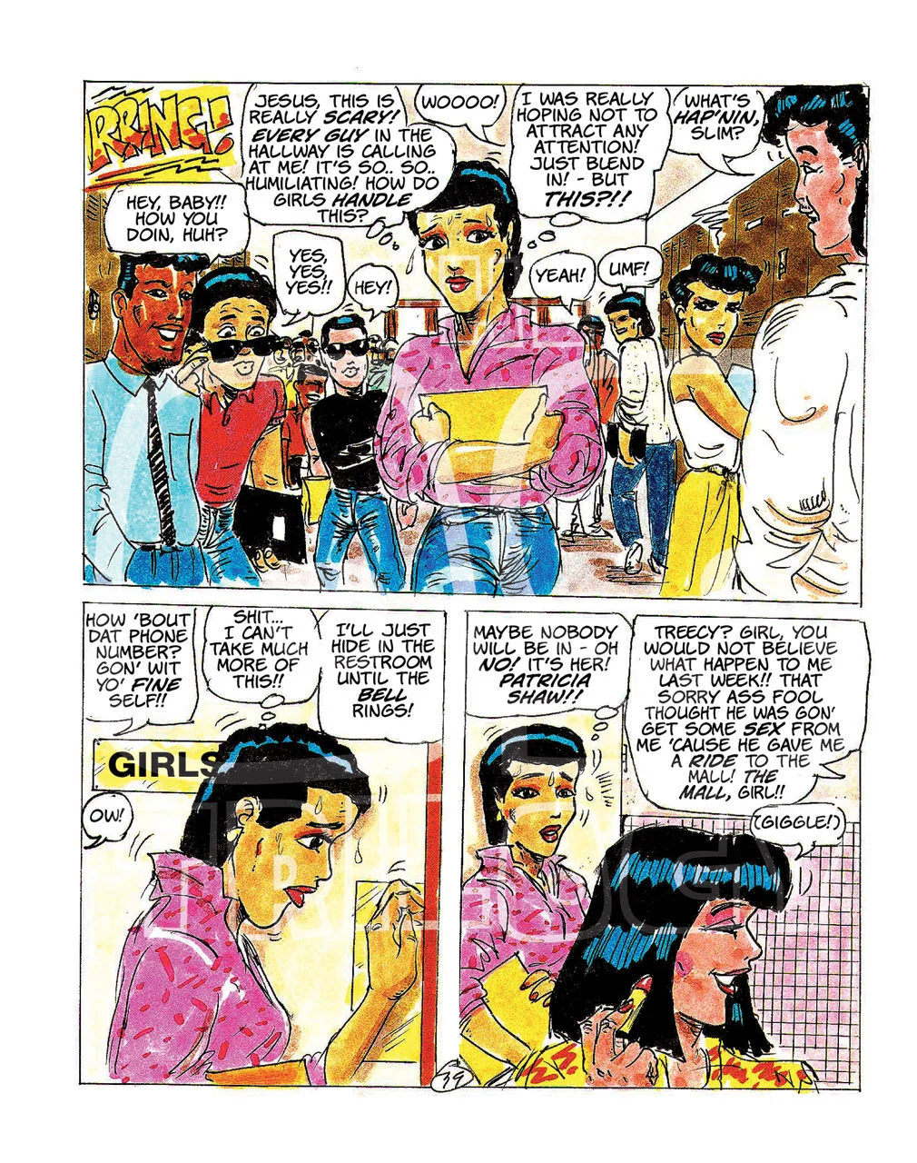
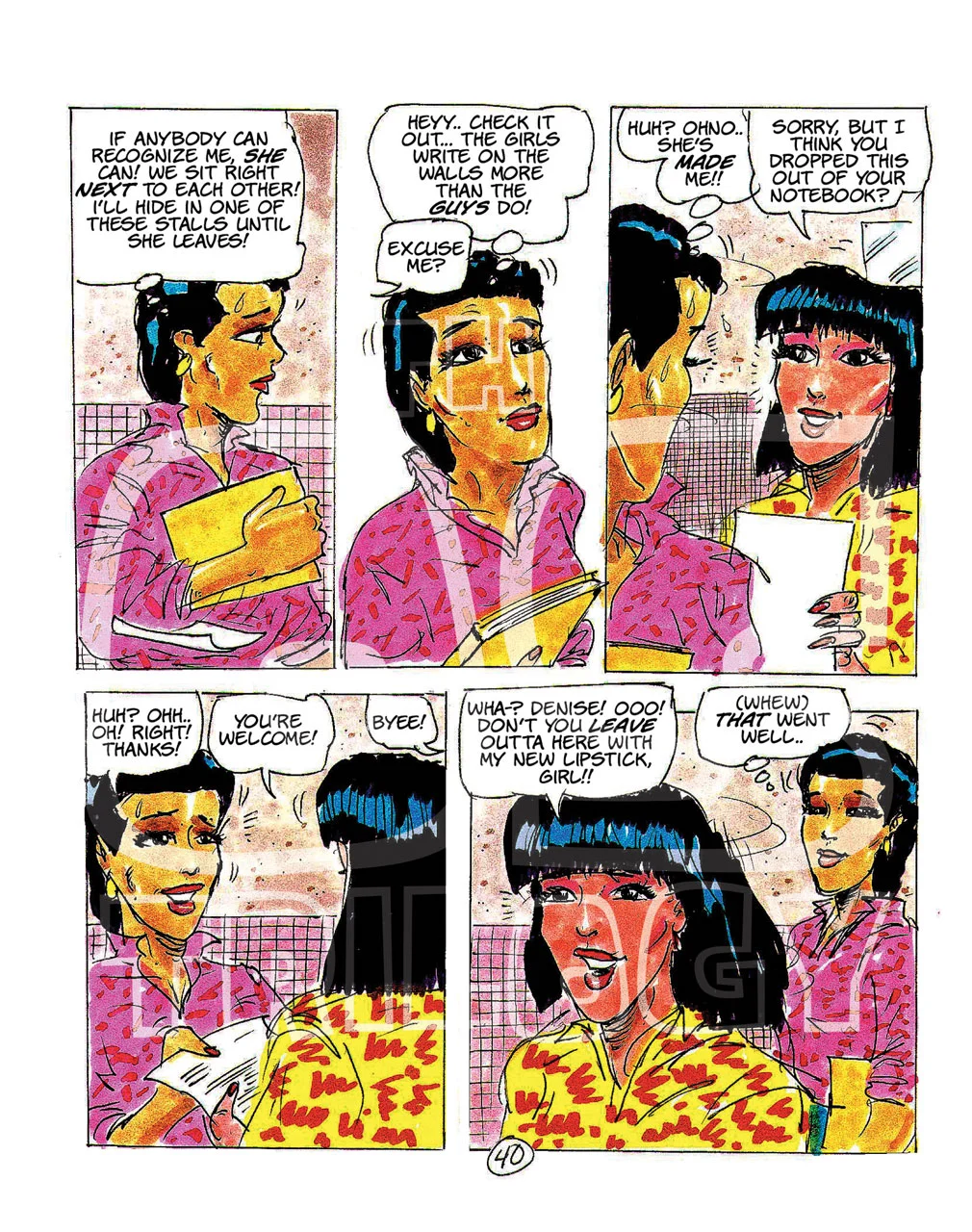
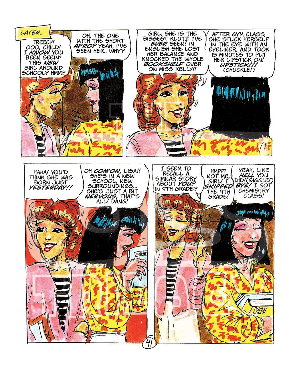
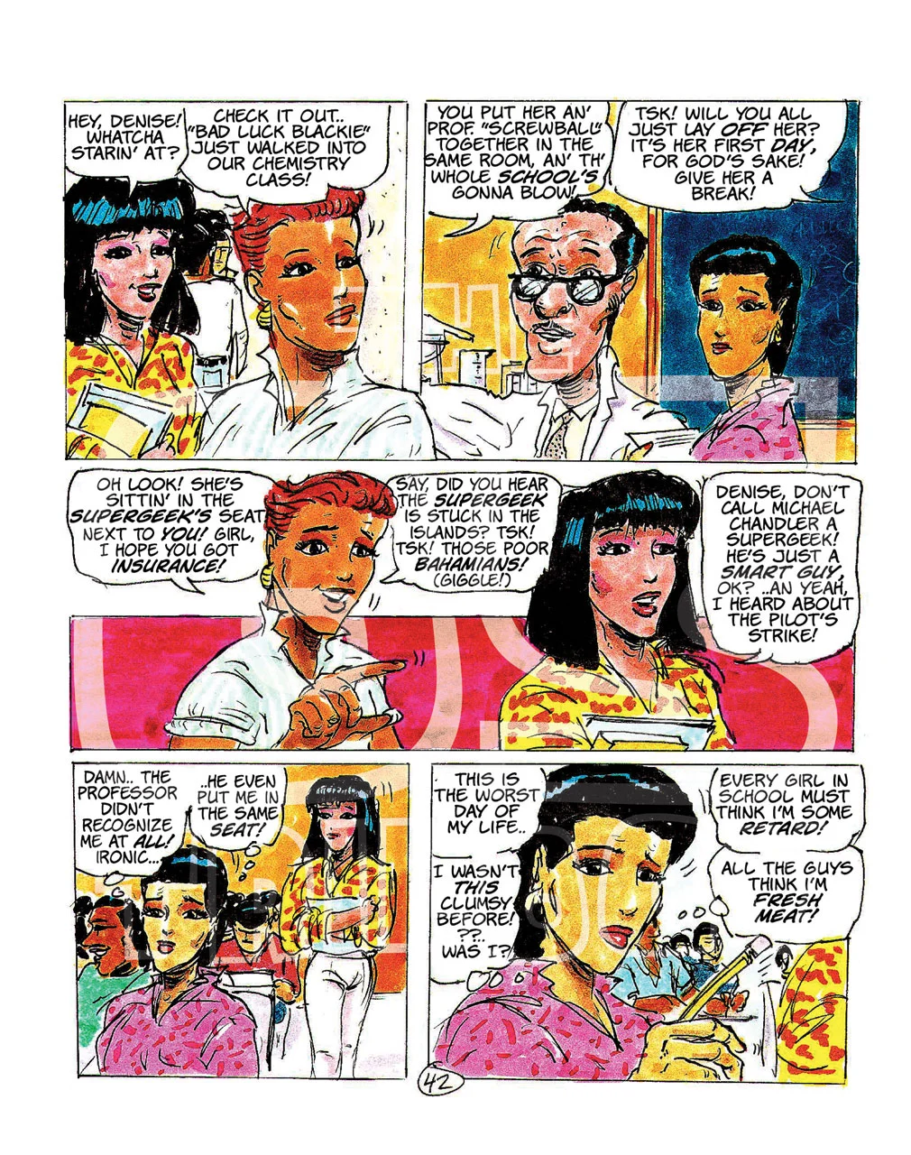
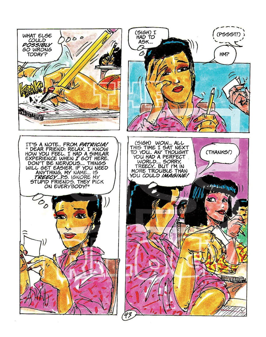
The techniques I’m showing here are from that second webcomic, the sequel I worked on and posted online for nearly six years. Years later, that same story became Opposite Again and Opposite Still. So while you may know it today as two books, what you’re about to see is how I actually drew it as an original webcomic, one page at a time.
But enough about all that.
Here’s how I drew the thing.
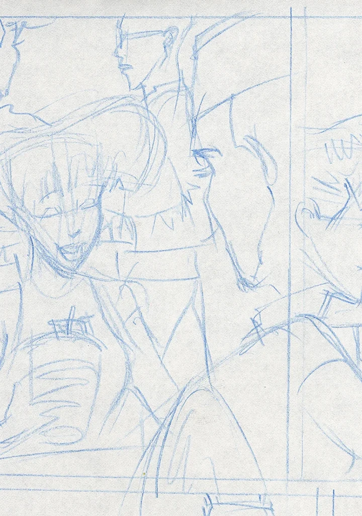
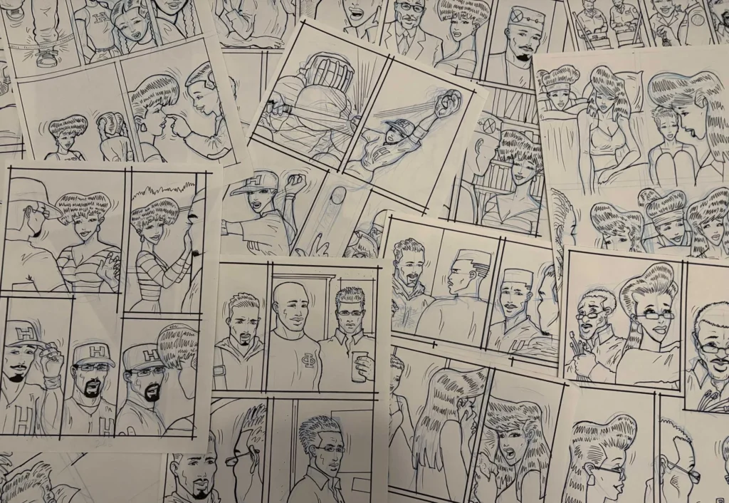
I tried to view the storyline in weekly blocks, or three-page segments. So I always drew a minimum of three pages at a time. I used a non-repro blue pencil, usually Staedtler Mars or Prismacolor Verithin. I went through them pretty quickly, so I tended to buy twelve at a time.
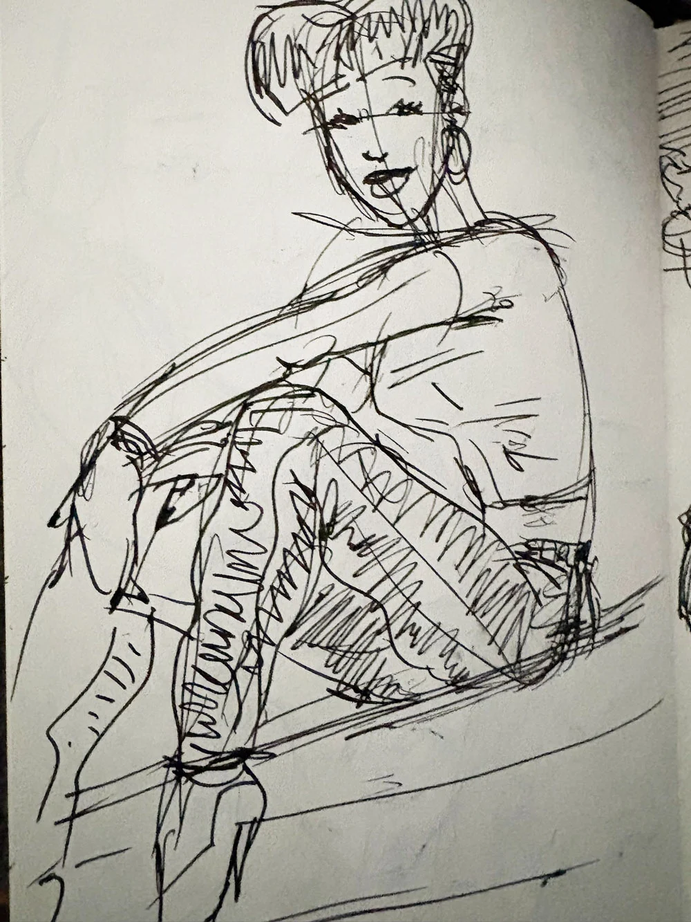
I started by roughing out the positions of each panel, then filled them with characters and objects relative to the scene. The great thing about the blue pencil was that I could make changes without worrying too much about the mess. None of those preliminary marks would show in the finished artwork.
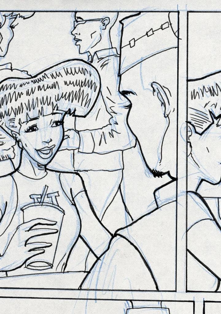
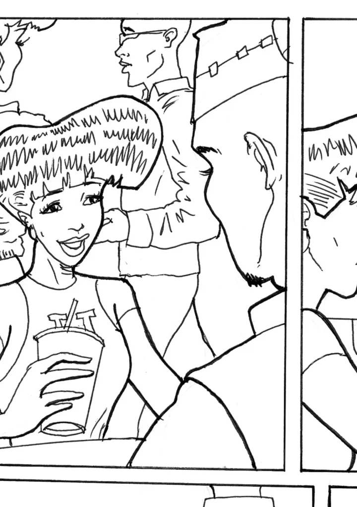
I was still a bit Old School when it came to inking, so I mixed traditional techniques with digital ones. I traced my blue lines using about four different pens and nib sizes. I liked the slightly rough look they created. It kept the drawings feeling casual and loose. Once the basic inking was finished, I scanned the drawings in grayscale. Then, using a Wacom pen tablet, I added the finishing outline work in Photoshop.
Once the line art was cleaned up, I opened the file in Adobe Illustrator. At this stage, I dropped the opacity of the artwork to about 64% and added two new layers: one for the text and another for the balloons. Back then, I chose Comicraft’s Wild Words as my font. It was a bit pricey, but it was extremely legible and fit the style of my work.
I didn’t use pre-designed word balloons because I tended to bounce a lot of dialogue around inside each panel. Instead, I used the Pen Tool to draw custom balloons around each statement. That gave me a lot more freedom to work the dialogue into the artwork instead of forcing the artwork to fit the balloons.
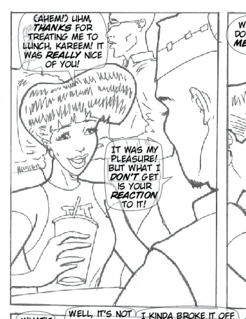
I also dropped the opacity of the balloons so I could see exactly what they would be covering. If the elements behind them weren’t important, I was okay with letting them disappear. But if the artwork started feeling too crowded or I covered something I wanted the reader to see, I moved things around. The trick was to stay focused on the flow of the story, no matter what. When I was satisfied, I saved the page as an Illustrator file.
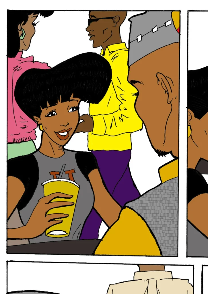
Then it was back to Photoshop.
I opened the original Photoshop file and converted it to RGB, which was better suited for the digital coloring I was about to do. To eliminate a lot of repetitive clicking, I had created about nine Photoshop Actions to handle some of the more complicated tasks. I duplicated the artwork layer, set it to Multiply, and started coloring with a collection of custom brushes I had saved specifically for the comic.
I also picked up a cool tip from another webcomic artist: create a separate file of color swatches organized by character. That saved me from keeping a bunch of old pages open just so I could constantly sample colors from them. At this stage, the color layer contained only the flats.
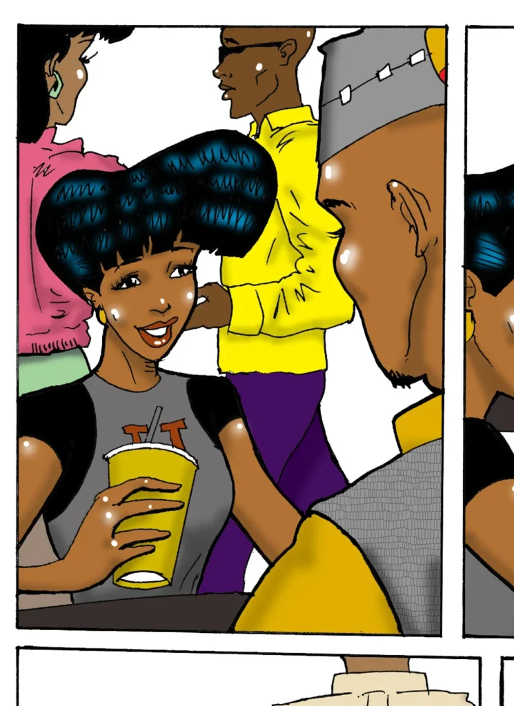
On a new layer, I added the shadows and highlights, giving each illustration some depth and a little more pop. The white-highlight technique came from my early airbrush style and had sort of become a trademark of my work by then. I eventually toned it down a bit to keep the characters from looking too plastic.
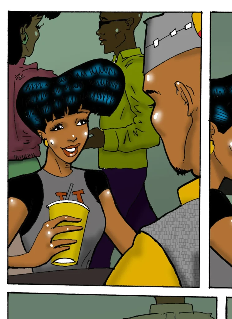
I used additional layers to manipulate other parts of the panels, including clothing patterns, wall textures, sound effects and whatever else a particular page needed. The technique varied from page to page. I didn’t like overdoing the same effect. That got boring. I wanted to experiment and grow creatively with every page I drew.
It was sort of like being in Art School again.
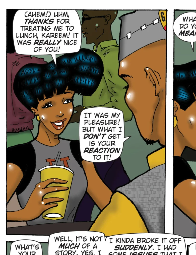
Once the color artwork was finished, I returned to Illustrator and “relinked” the COLOR Photoshop file, replacing the grayscale version. I brought the artwork opacity back to 100%, converted the text to outlines, and exported the entire page back into Photoshop.
Once there, I ran another Action that handled about seven different steps and created a JPEG version in my web folder, ready to post online.
That was my technique. It probably sounds time-consuming, but I had worked out a pretty good schedule. At one point, I was about five weeks ahead of my posting dates. As I said earlier, the trick was working in threes: three bluelines, three inkings, three scans, three lettered pages, three colorings, and so on. Instead of taking one page from beginning to end, I moved three pages through each stage together.
If you don’t have enough time to go through that many steps, remember that this is just my way. You have to discover what works for you and make it your own. Never bite off more than you can chew, or you’ll burn yourself out before you know what hit you.
Find a steady pace, commit to it, and work it into your routine. Before you know it, drawing your comic becomes just another part of your day.

